
Local Brockville Bakery Branding
Classic family owned bakery logo redesign that fits perfectly with the atmosphere of Tait's. The brown and serif fonts were inspired by the original logo and bakery interior. Client requested new logo, alt logo, and icon.
Software:
Adobe Illustrator, Adobe After Effects
Soft Skills:
Precision, Attention To Detail, Creative Thinking
Hard Skills:
Illustration, Branding, Motion Graphics
Creation Of Designing The New Logo
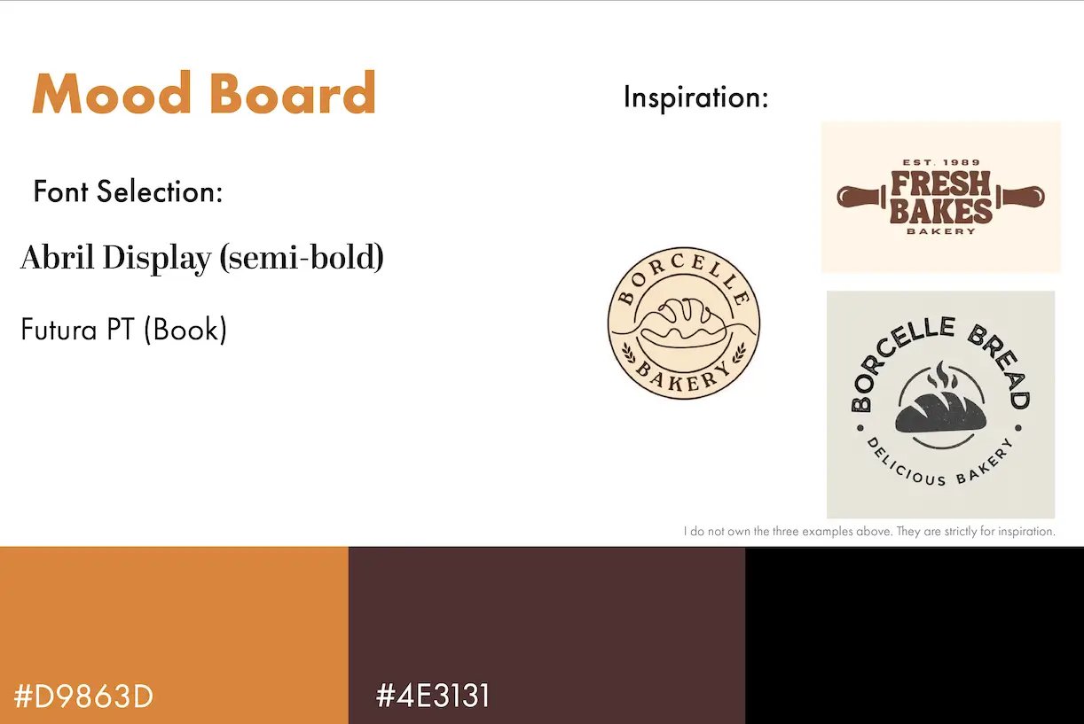
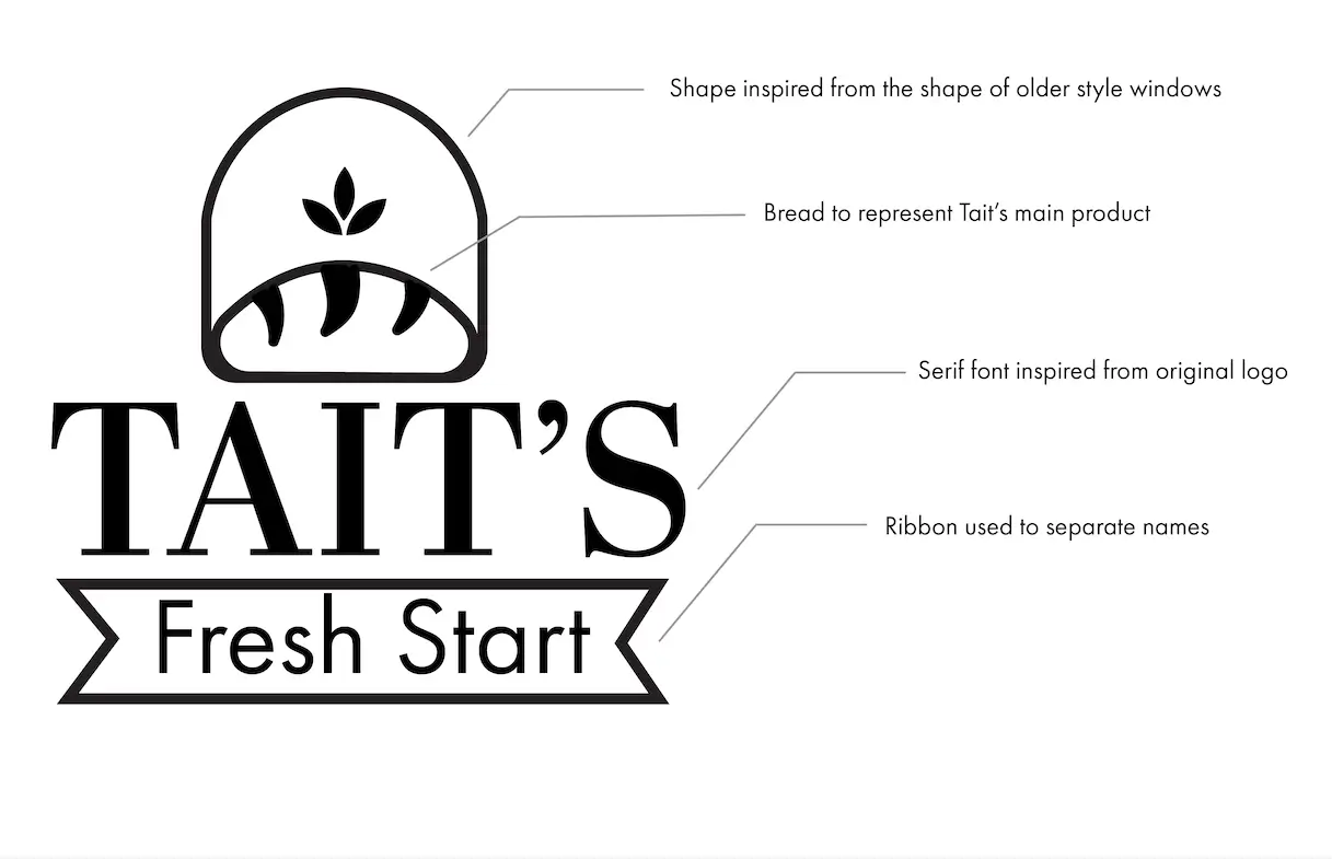
Being familiar with the bakery I wanted to make sure to create a logo that best fits the bakery. Their old logo was crowded and didn't scale down well which would affect recognition. Tait's is known for their breads so it was decided to be the focal point of the logo. The serif font was inspired from the original font that was also serif. The colours were also inspired from the interior and exterior of the bakery. I wanted to make sure the logo best suited the restaurant and could scale down easier. The new logo is more legible, clean and modern perfect for the bakery and deli.
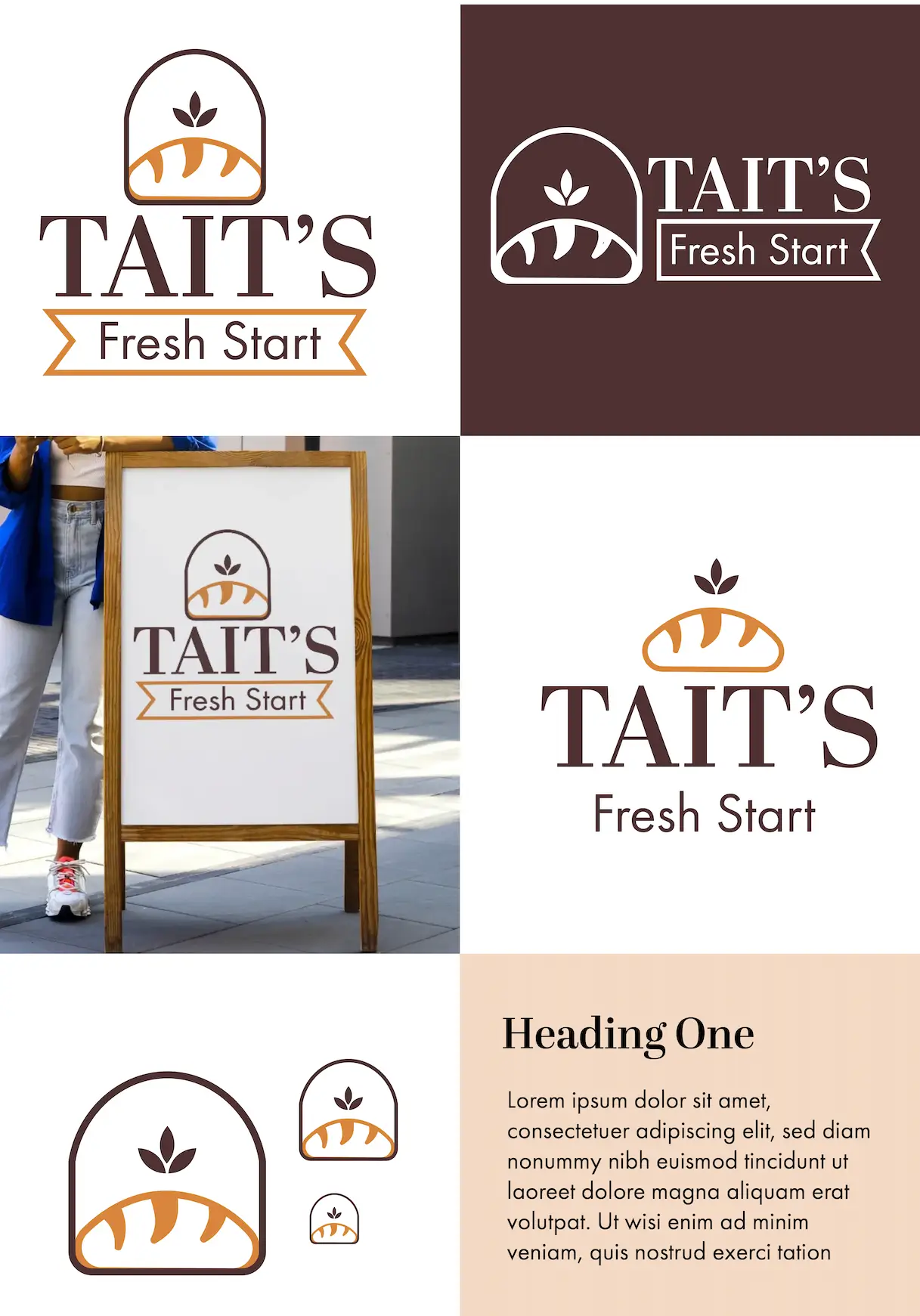
Mockups
View the applications of the logo.


Final Thoughts
Overall creating a new logo for a Brockville favourite was fun and I enjoyed learning about the history of Tait's. Taking inspiration from the original logo and the bakery itself was a challenging, but fun experience. I am glad with how it turned out. If I could change one thing it would be the style of the bread. I would experiment more with including a more detailed bread texture and I would take more inspiration from their history.


